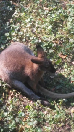
 Quite a difference between these tw-OH MY GOD, WHY IS THE TEXT TO THE SIDE INSTEAD OF UNDERNEATH!? So I took a picture of a kangaroo (I think) at the zoo and I photoshopped the hop out of it... So the filter that this uses is Cutout, and it looks really cool. I manipulated the colors a little bit, and I used the dodge and burn tool. It sorta follows the rule of thirds because it's a bit off center. I like how colorful the kangaroo is compared to the grass it's sitting in, it's a nice contrast. 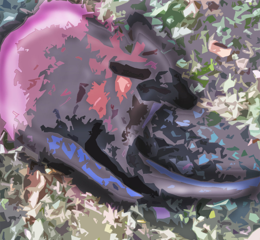
0 Comments
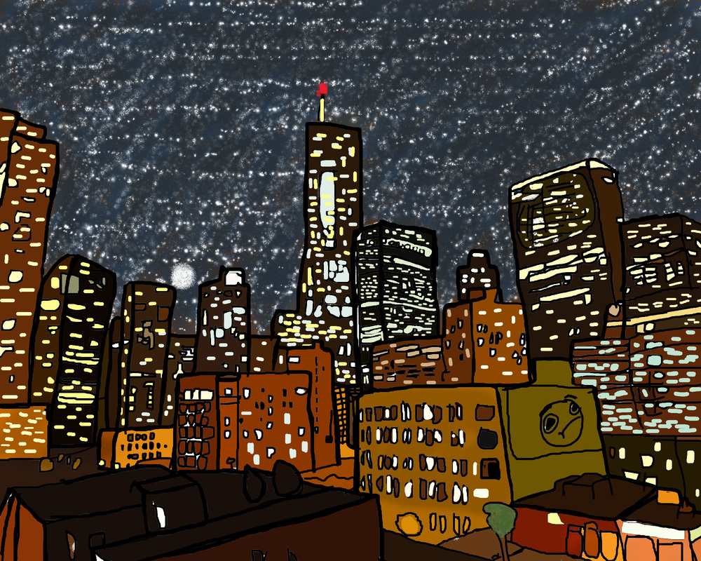 So this is a painting of a really nice angle of Chicago. I got the original photo (http://tinyurl.com/pwdno6e) from tripadvisor. I traced the outlines in photoshop, and I pretty much winged the majority of this painting. The sky is completely different than the original photo. It was too cloudy and boring, so I made the sky unrealistically have a bunch of stars in a city... who cares if it's unrealistic, it's cool. How I colored the buildings was really tedious, I used the water dropper to get the color of the building from the original photo. The buildings' colors were... interesting, but once they were all together, I liked how they turned out. The biggest thing I winged it on was the windows. I just drew window shapes on the buildings at random, but trying to keep somewhat of a pattern. I had to outline the painting a lot to make the buildings stand apart from each other... also because I just like outlines...
Overall, I really liked how this came out, and using Wacom tablets was cool, but I had... problems with them. |
AuthorI do stuff. A nuuu cheeki breeki. Archives
April 2017
Categories |
 RSS Feed
