|
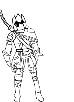
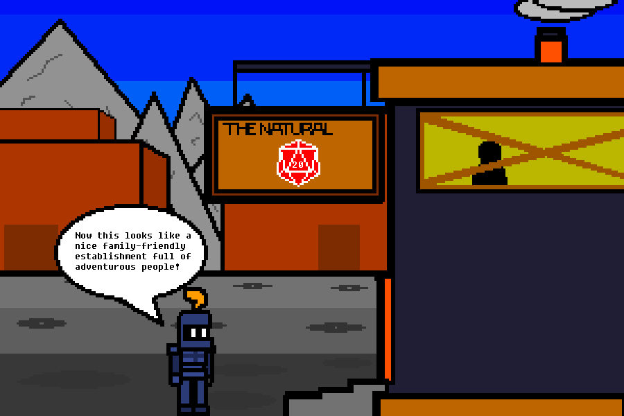
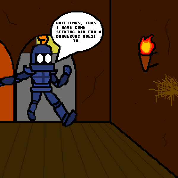
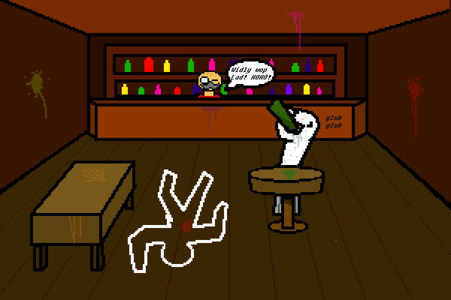
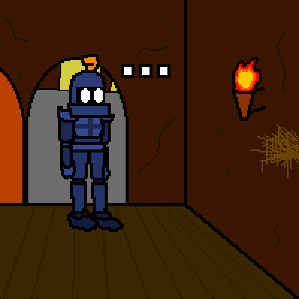
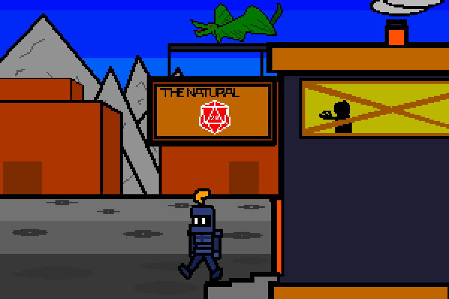
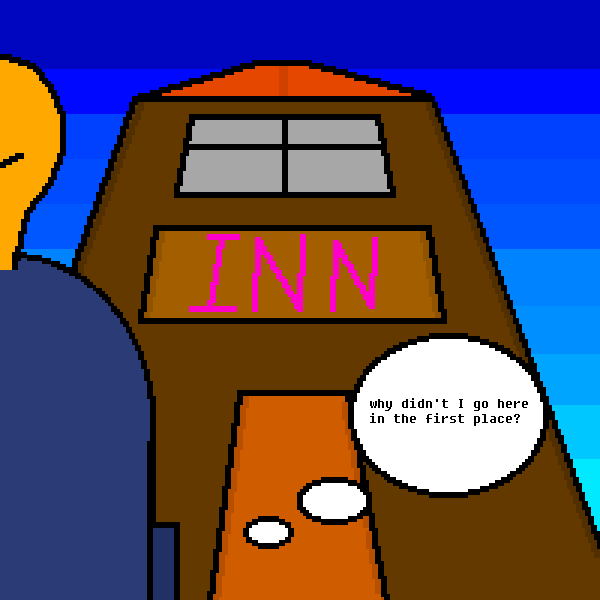
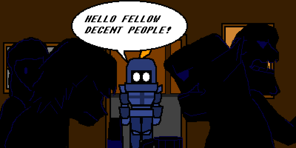
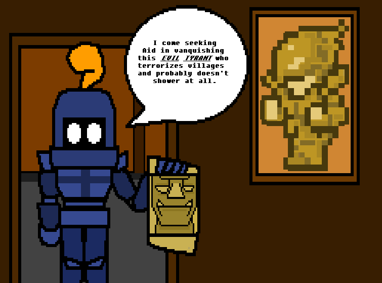
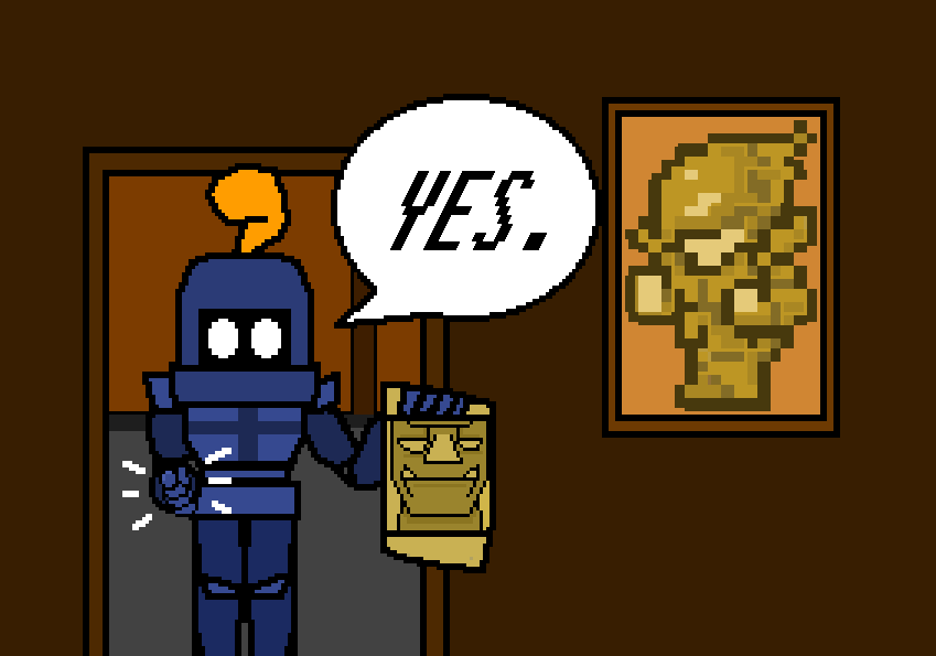
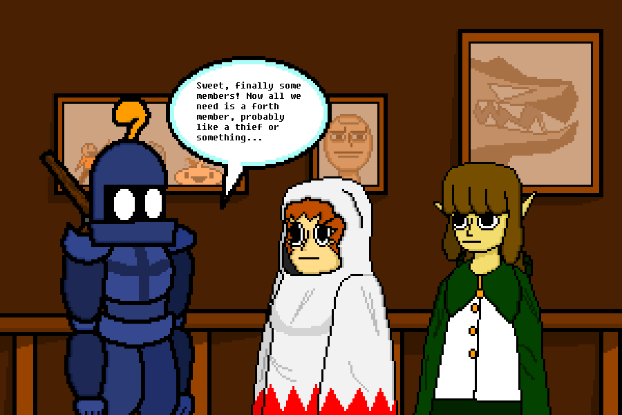
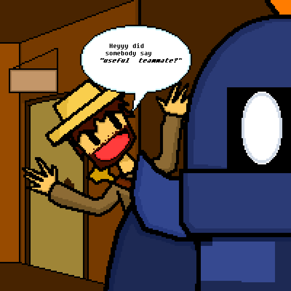
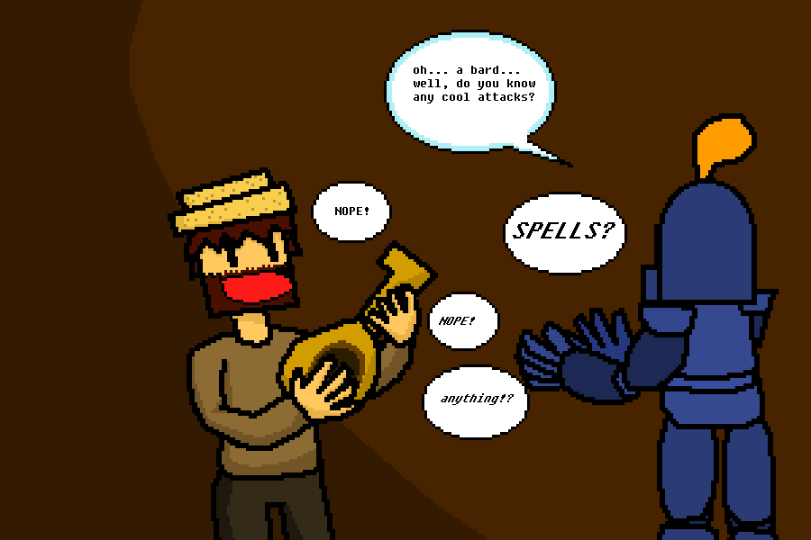
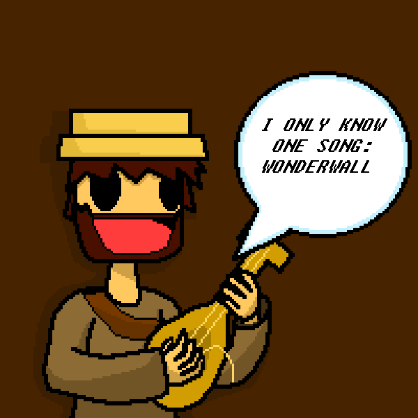
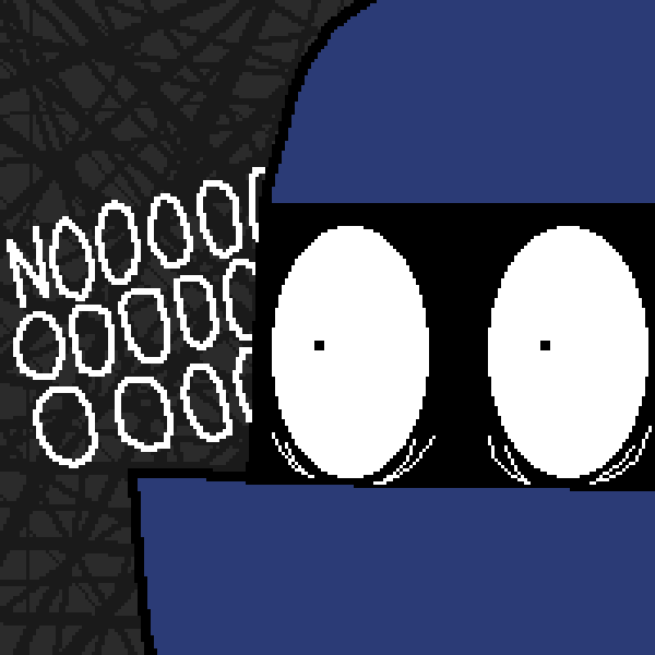
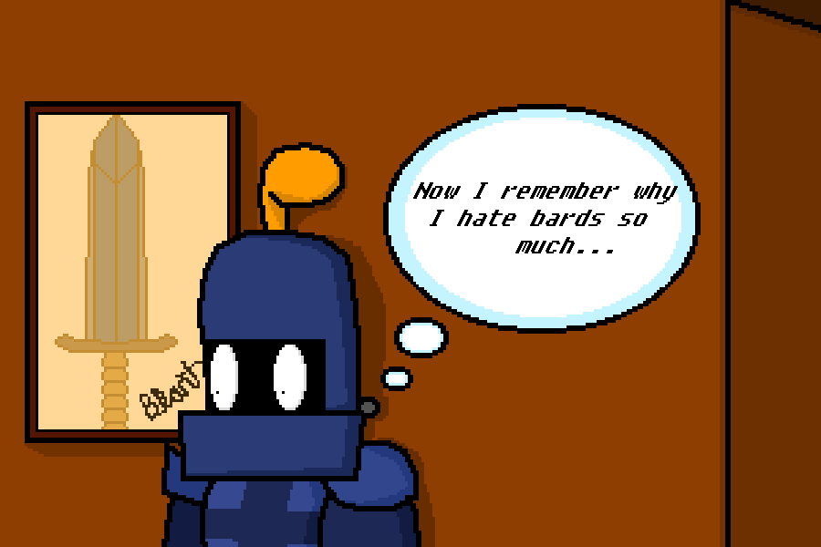
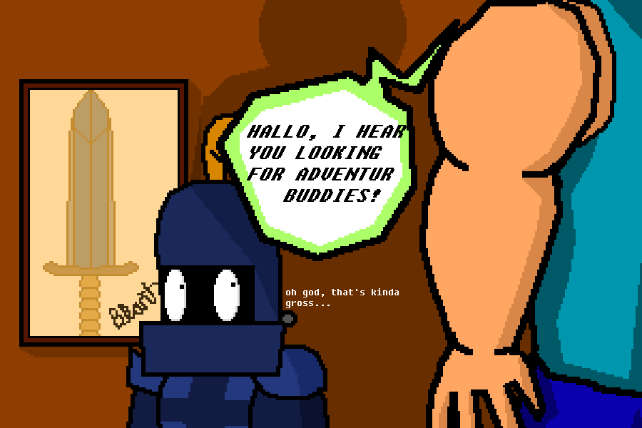
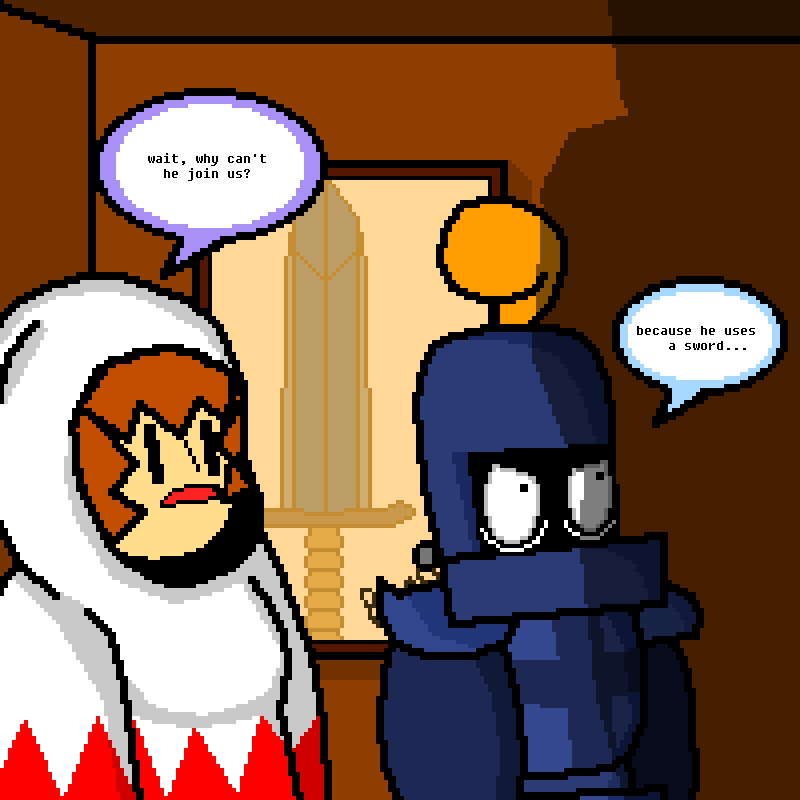
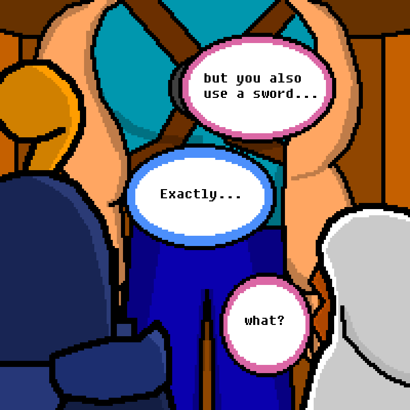
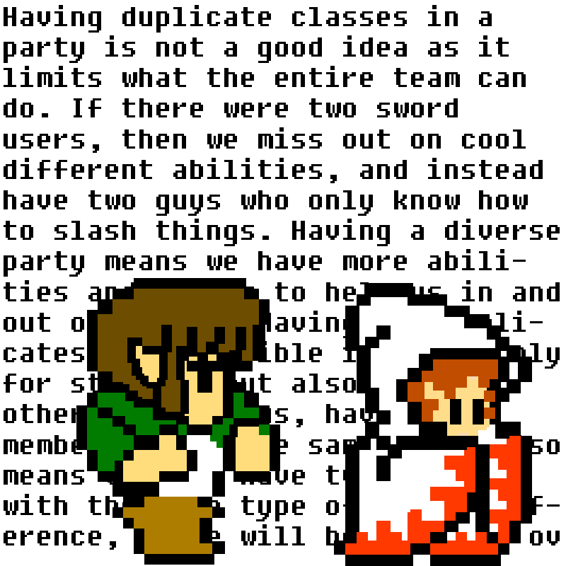
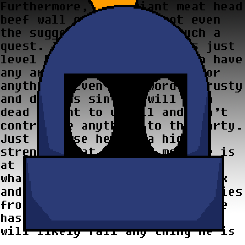
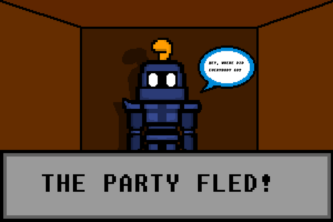
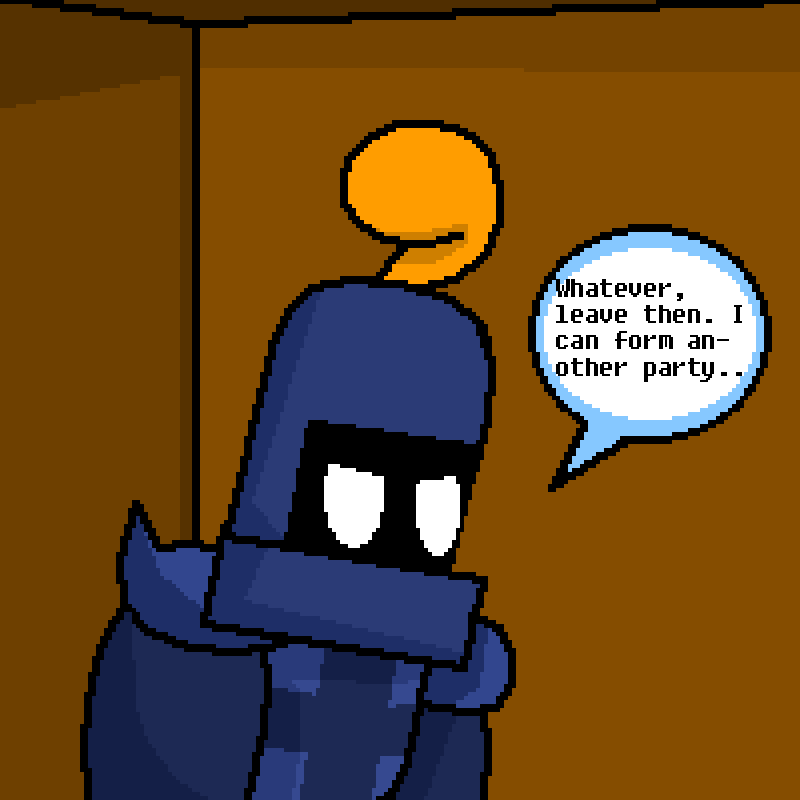
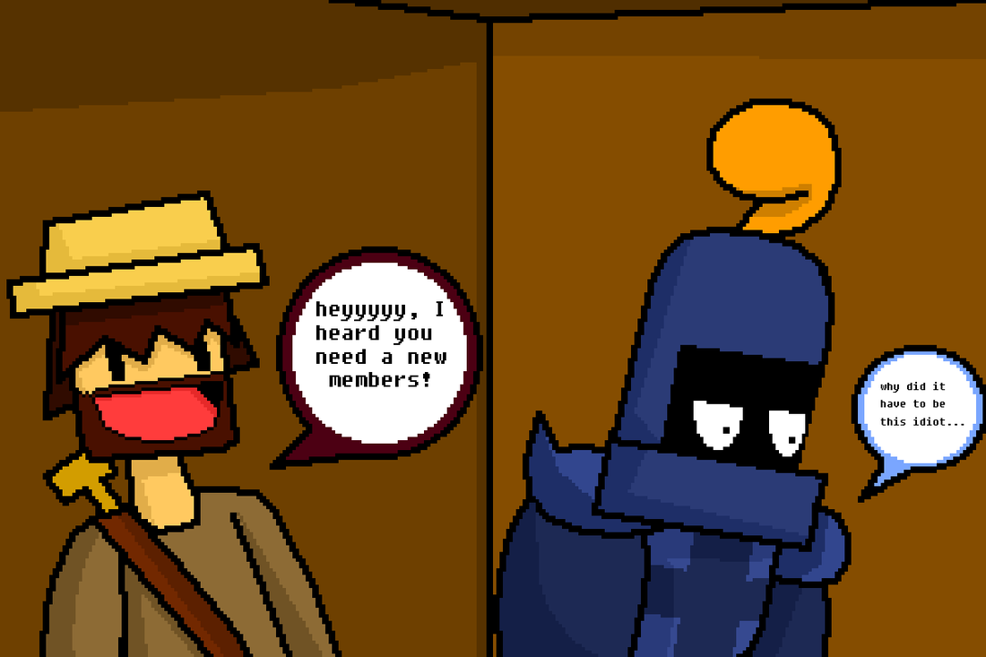
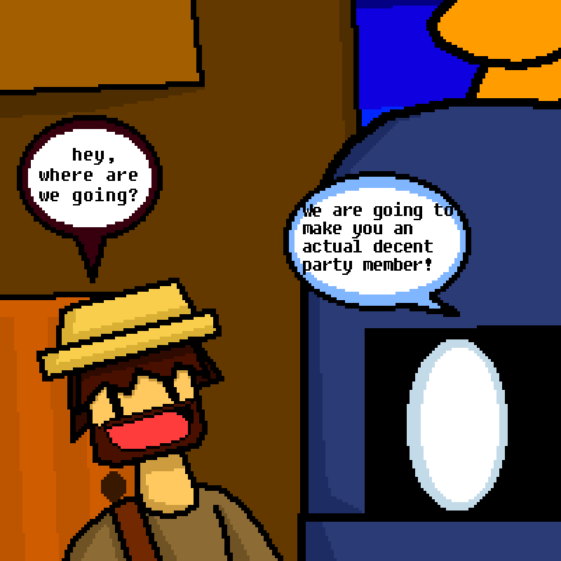
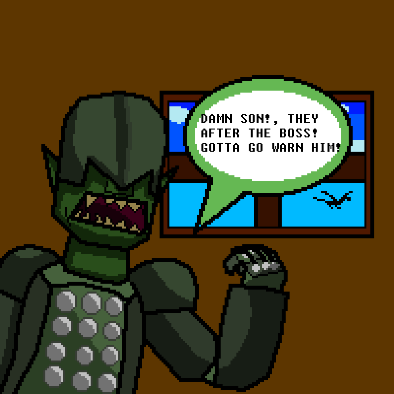
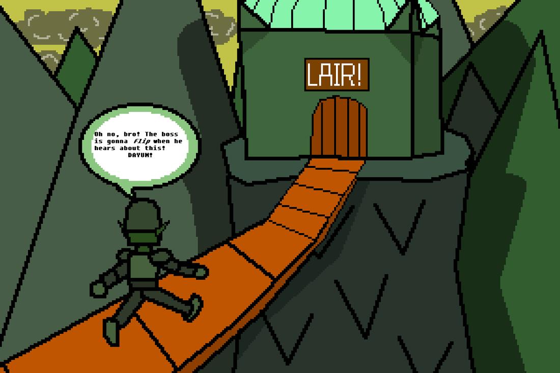
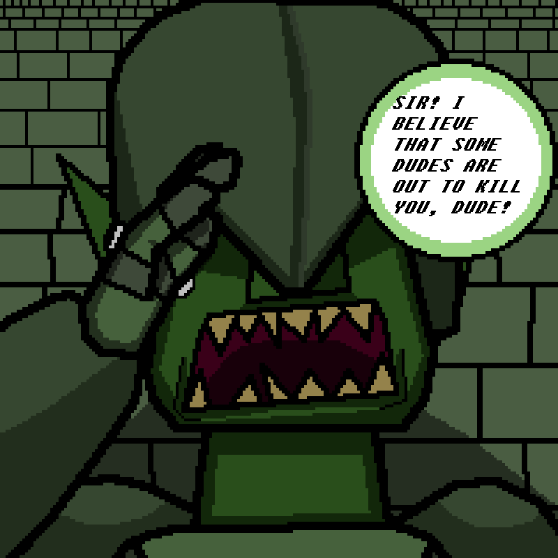
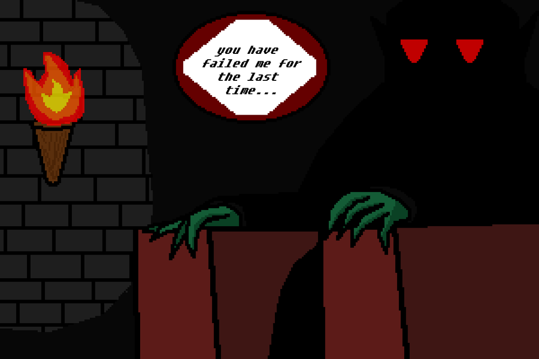
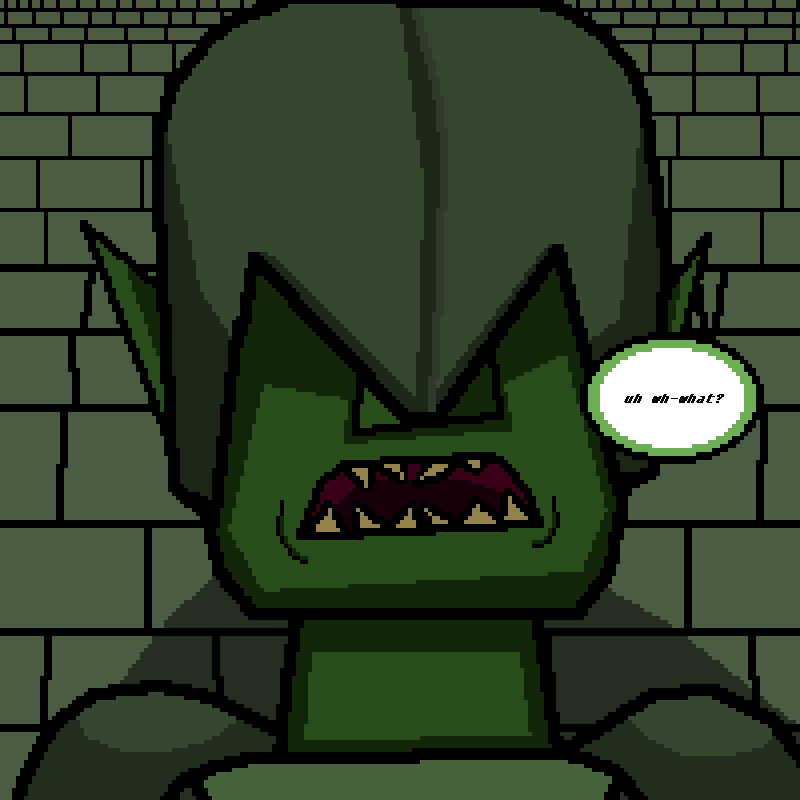
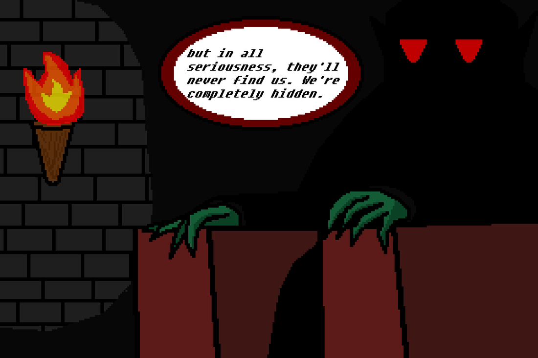
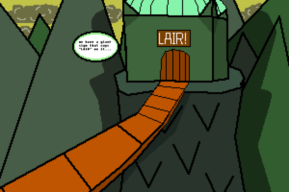
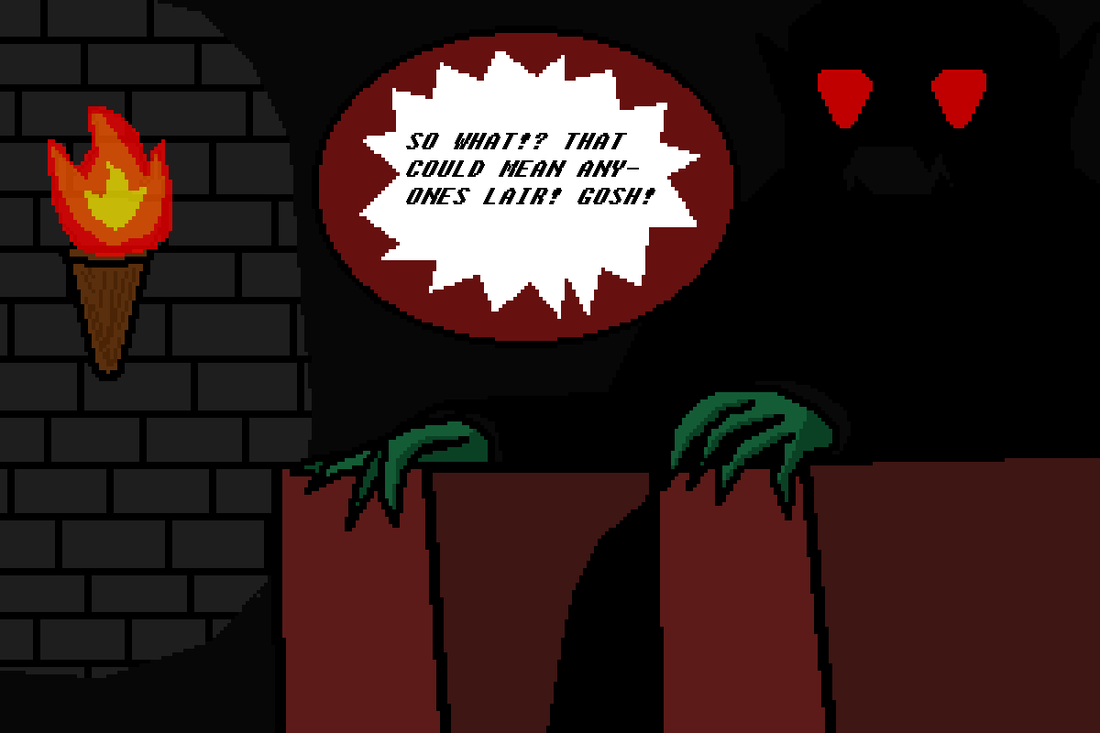
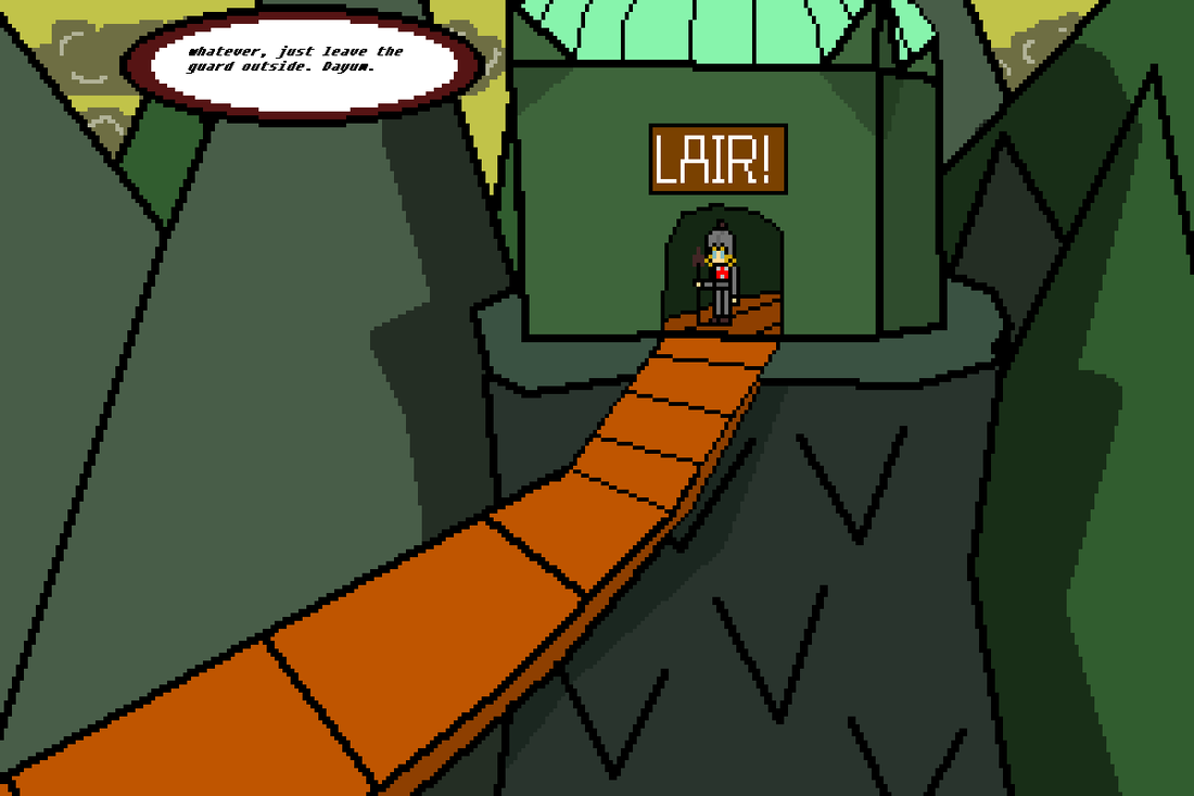
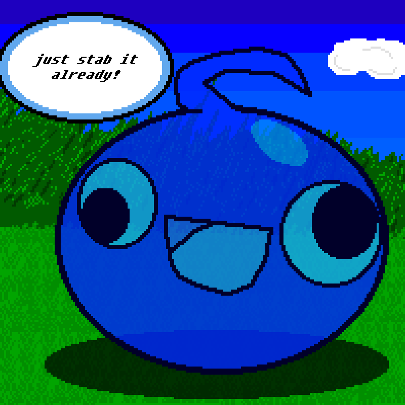
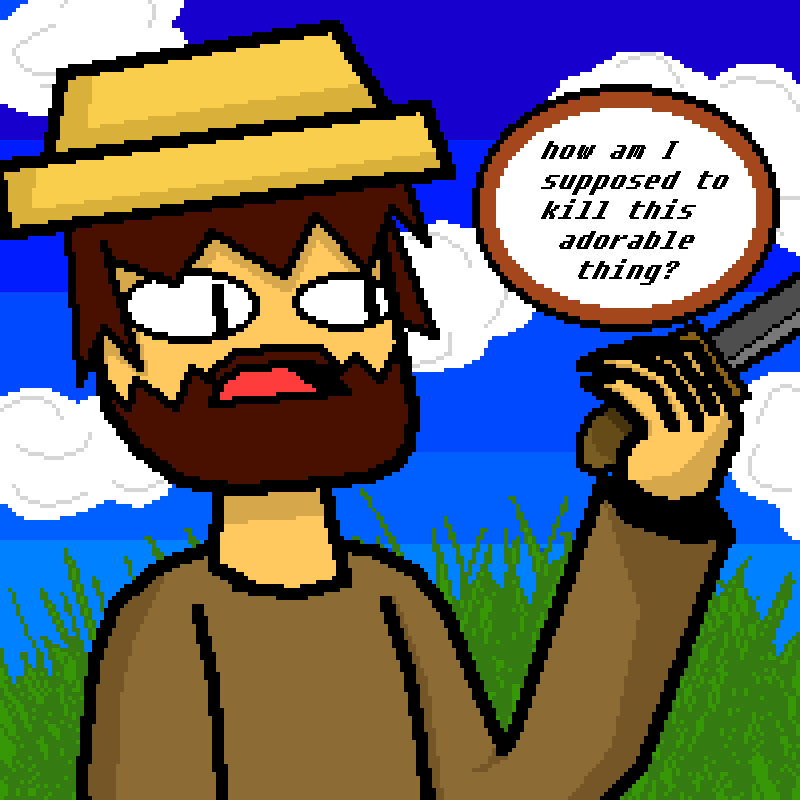
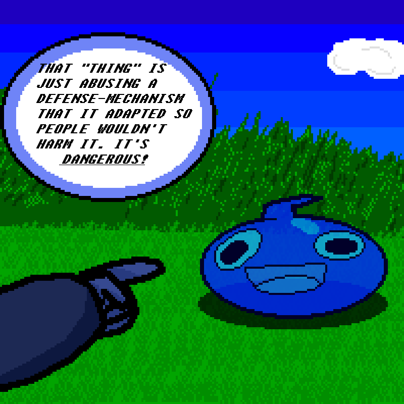
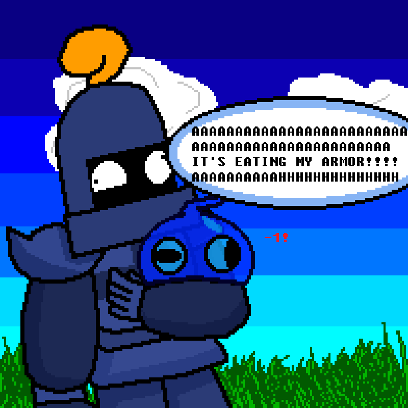
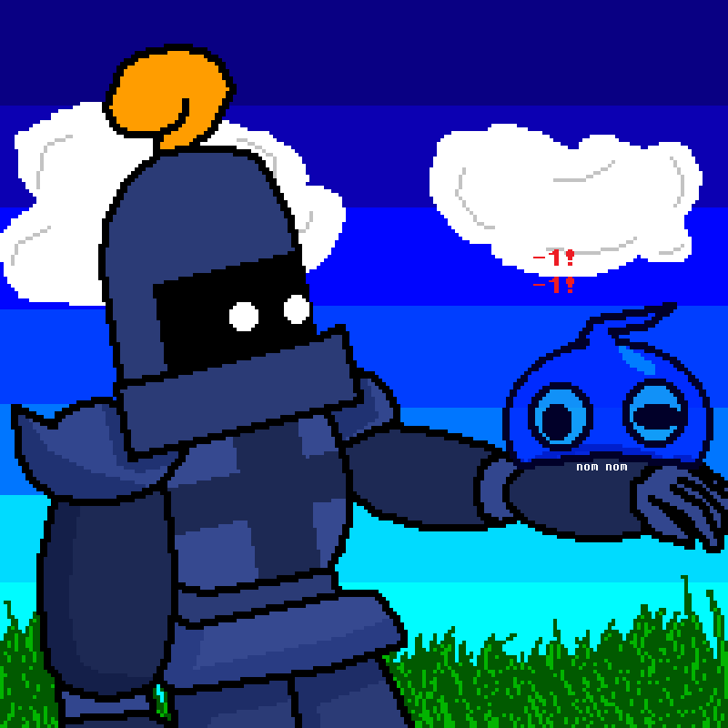
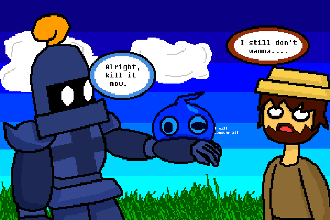
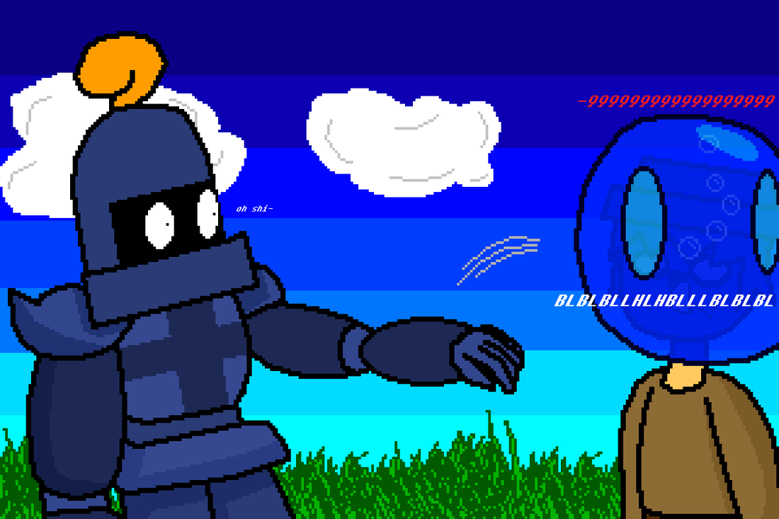
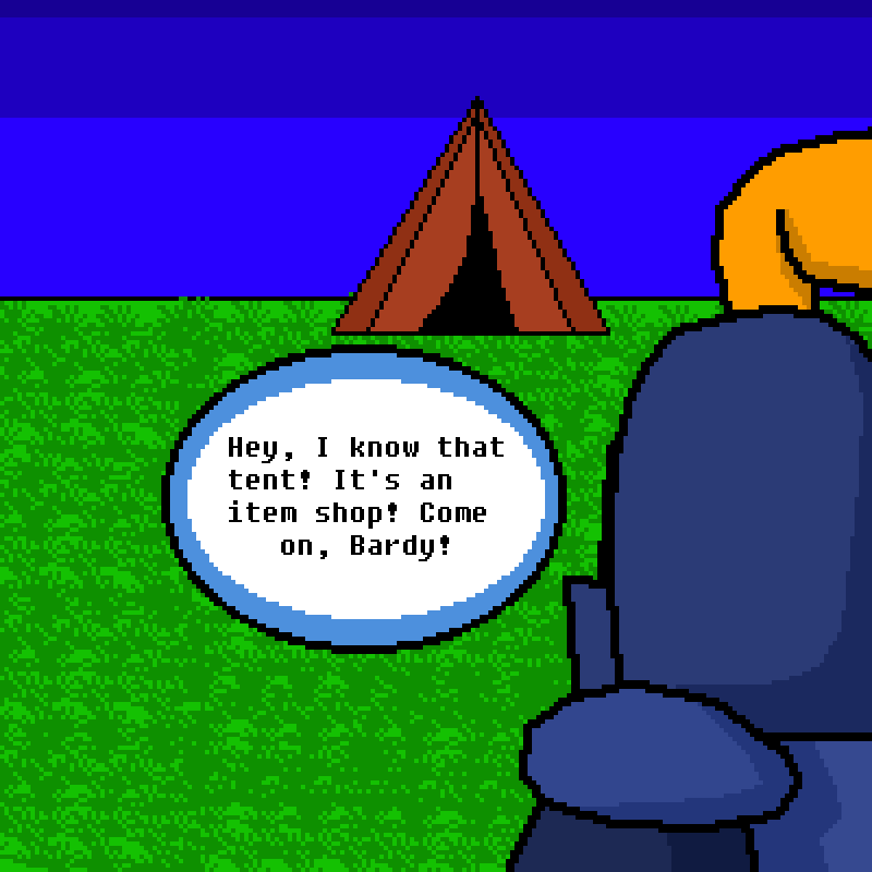
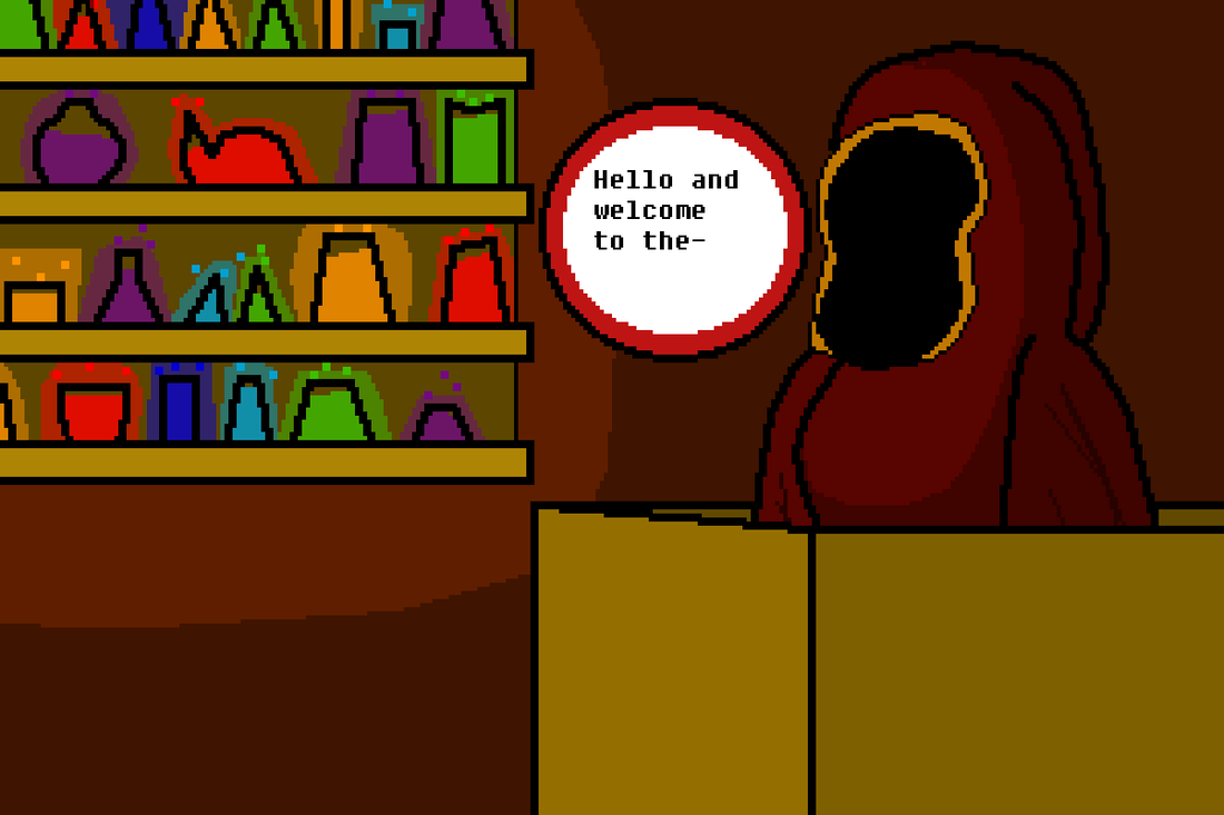
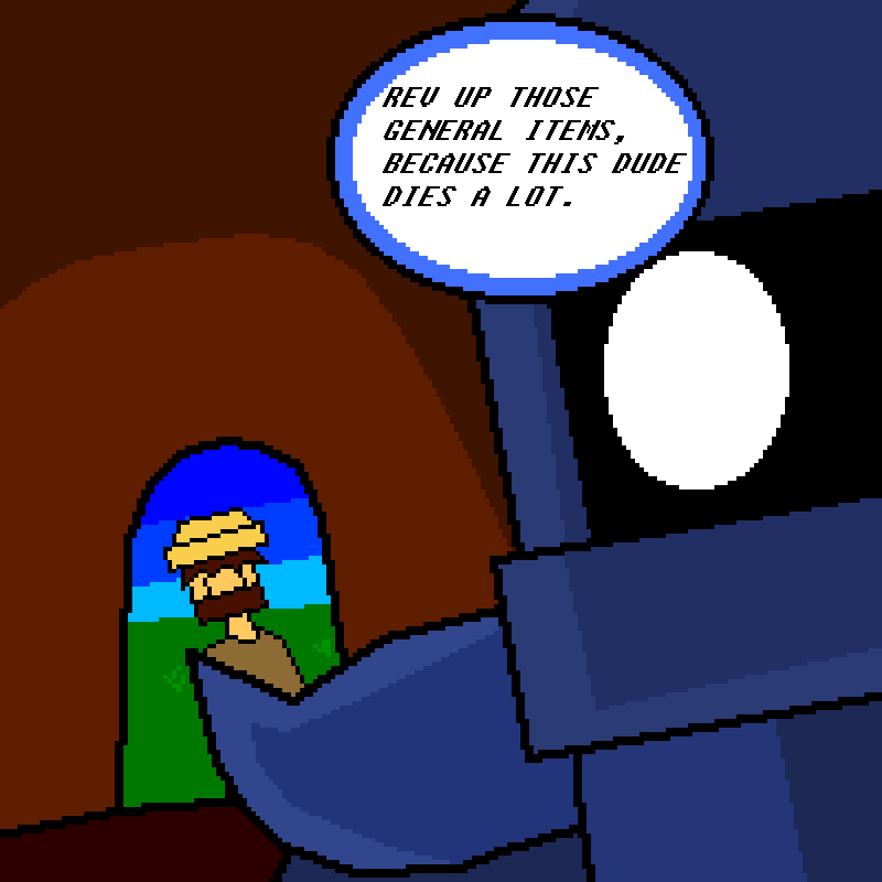
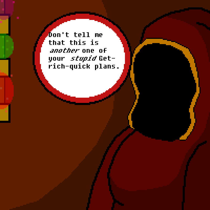
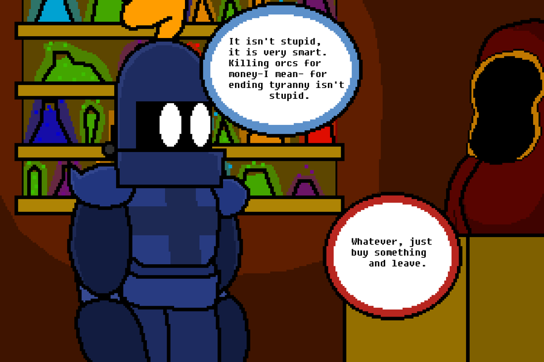
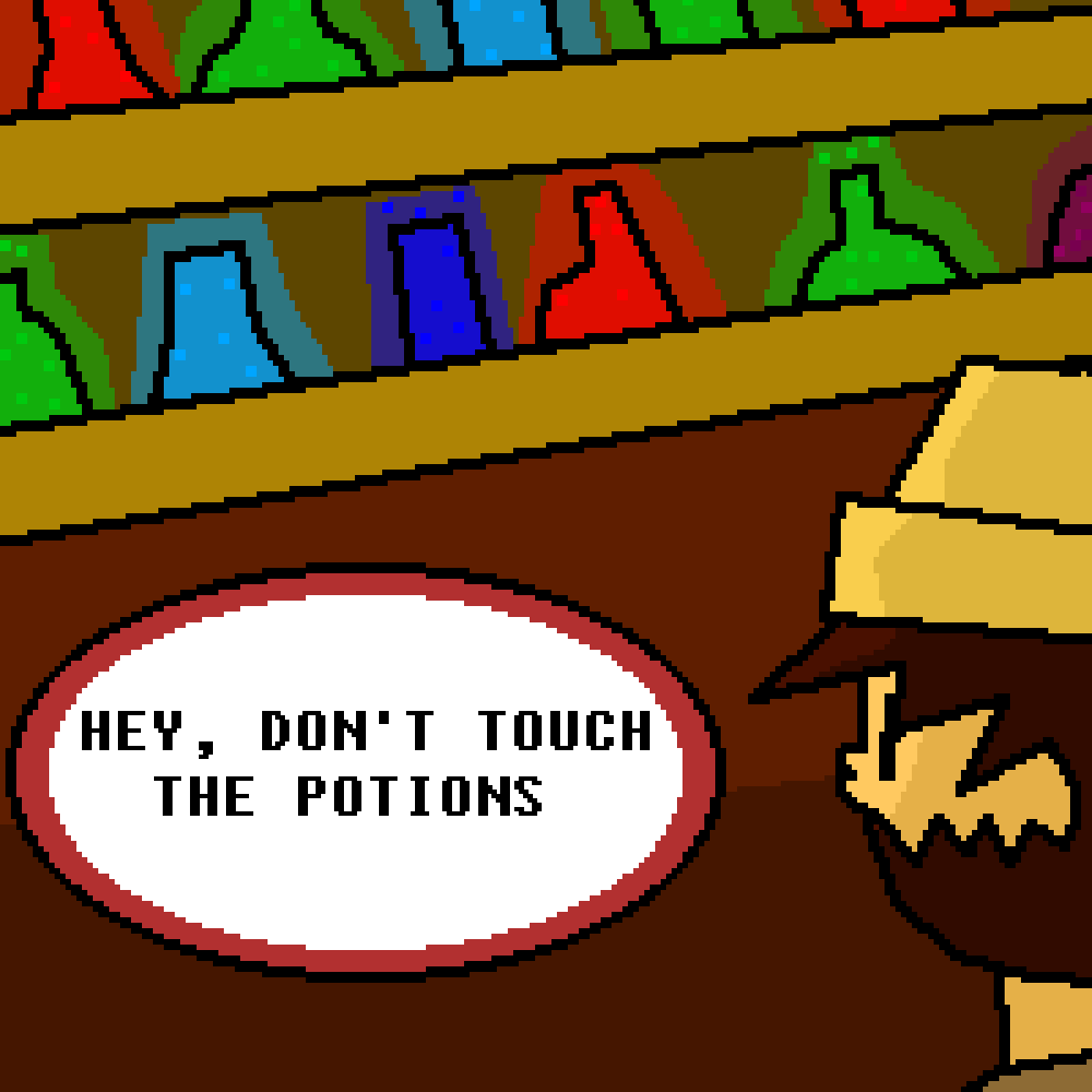
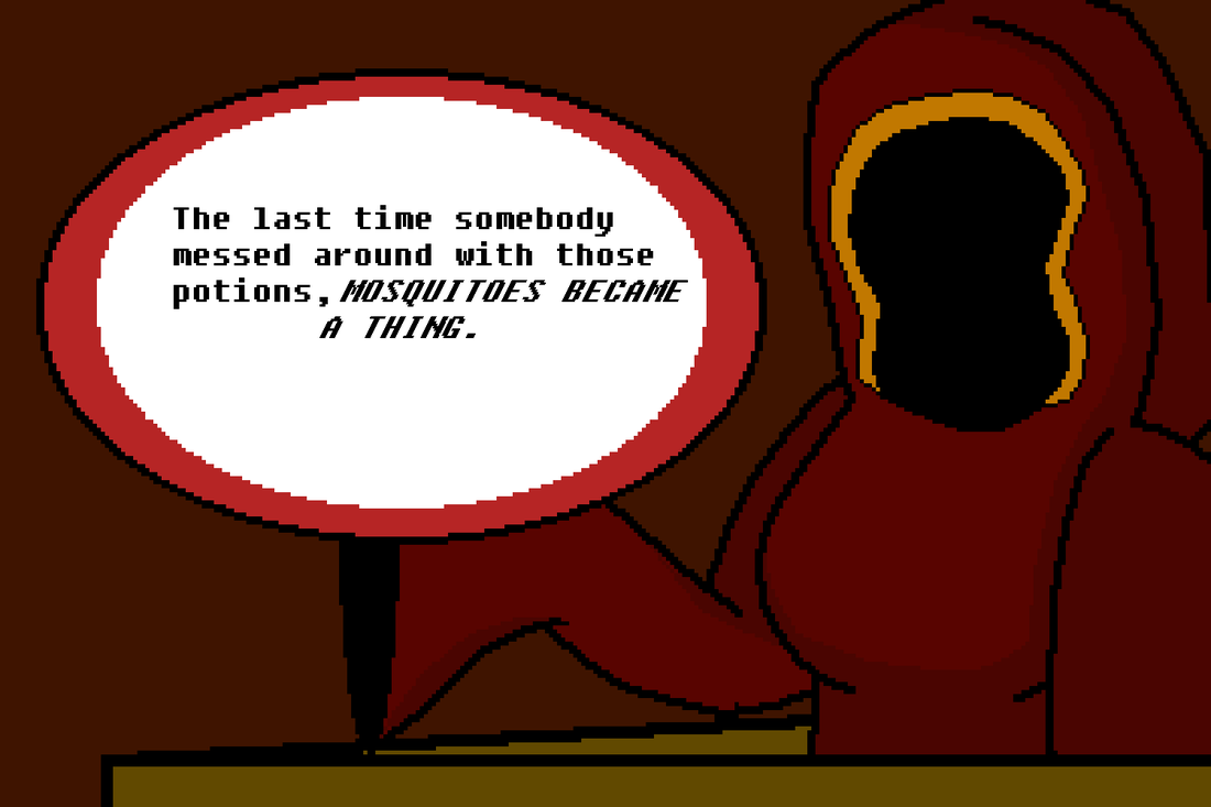
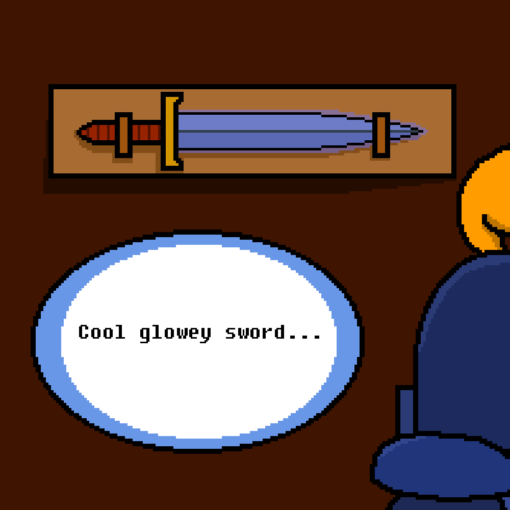
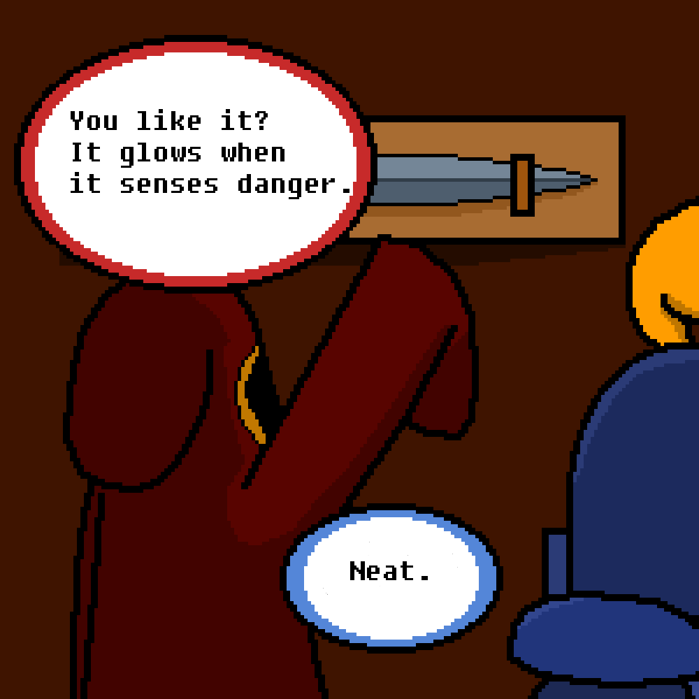
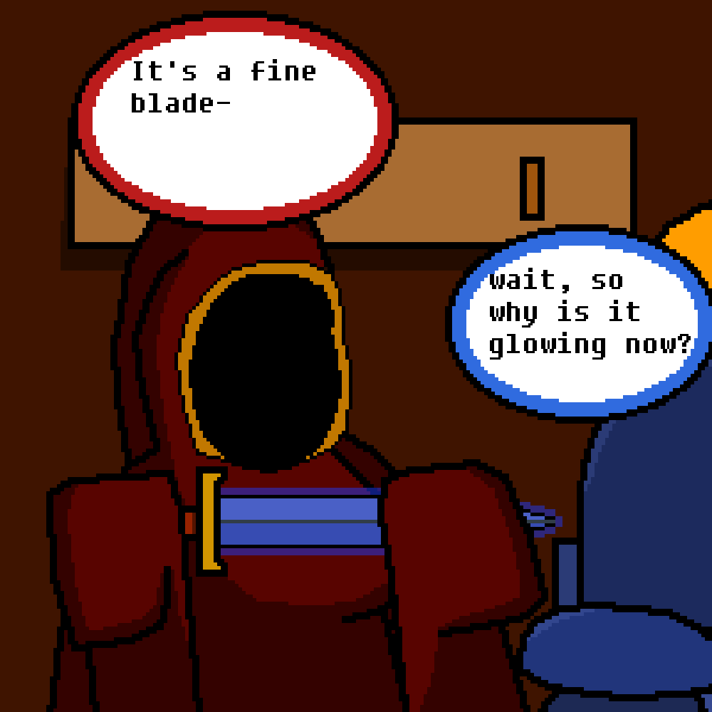
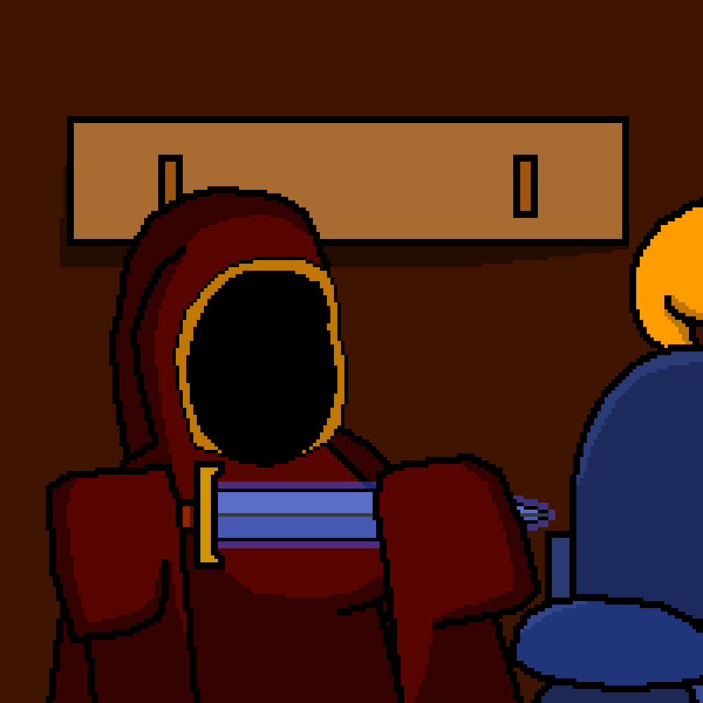
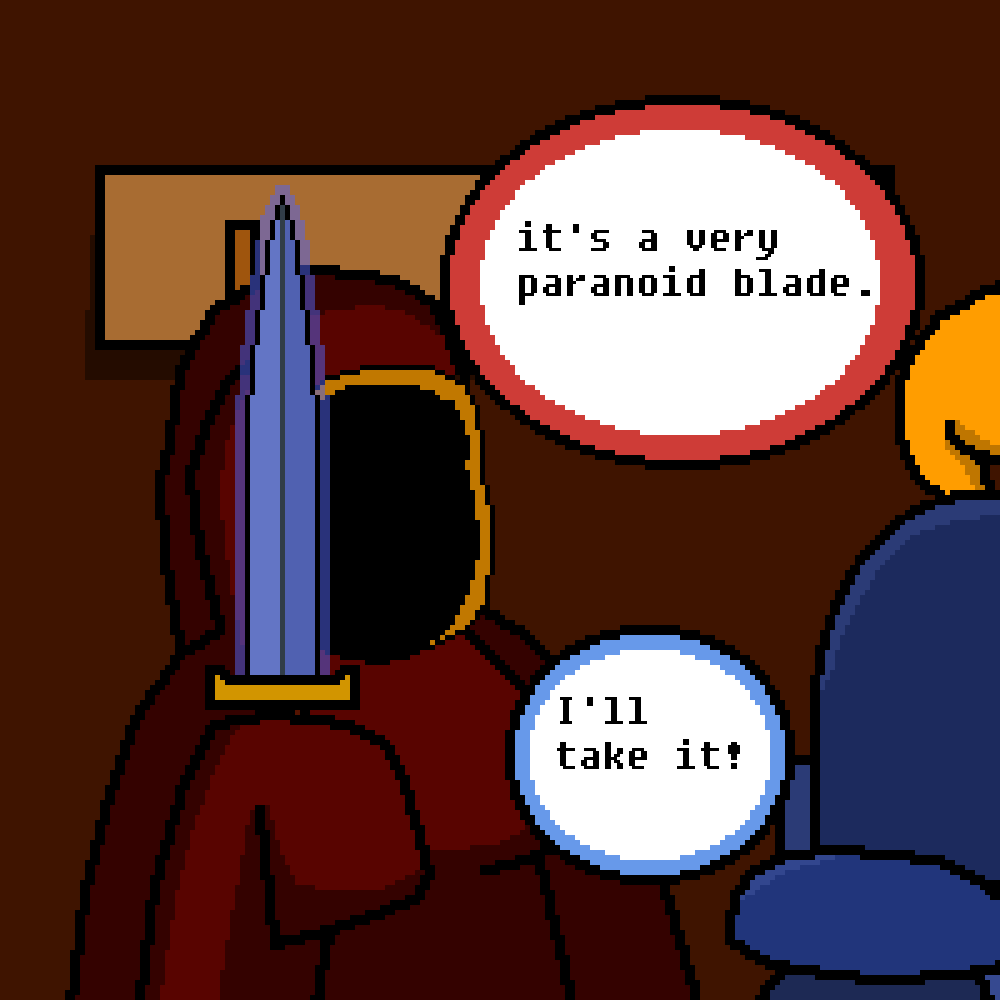
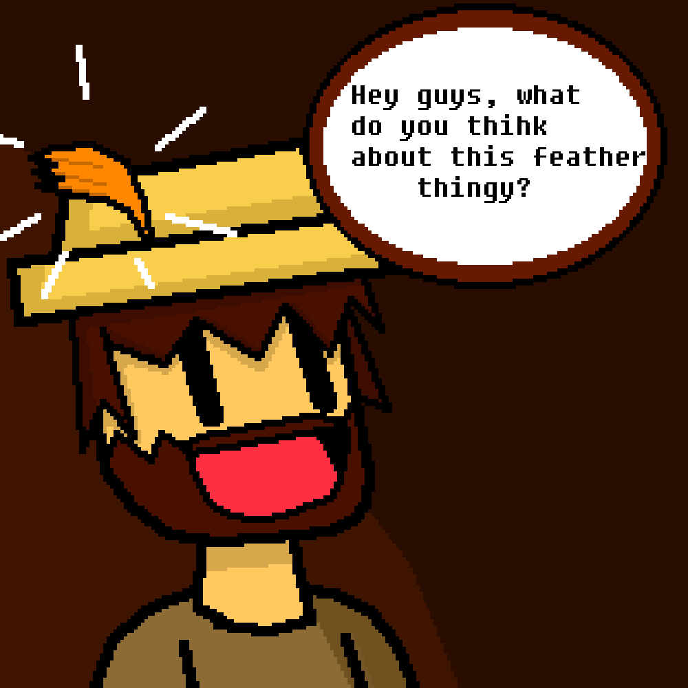
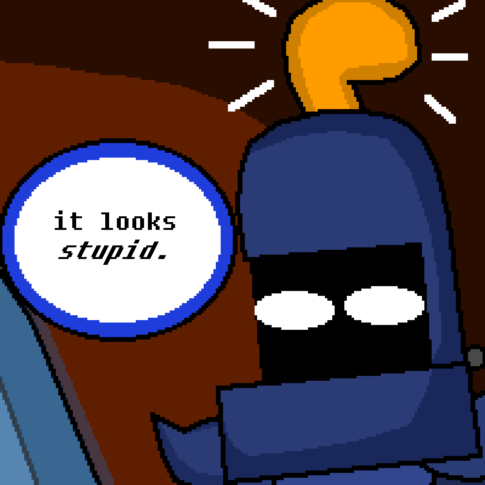
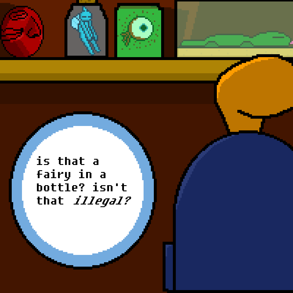
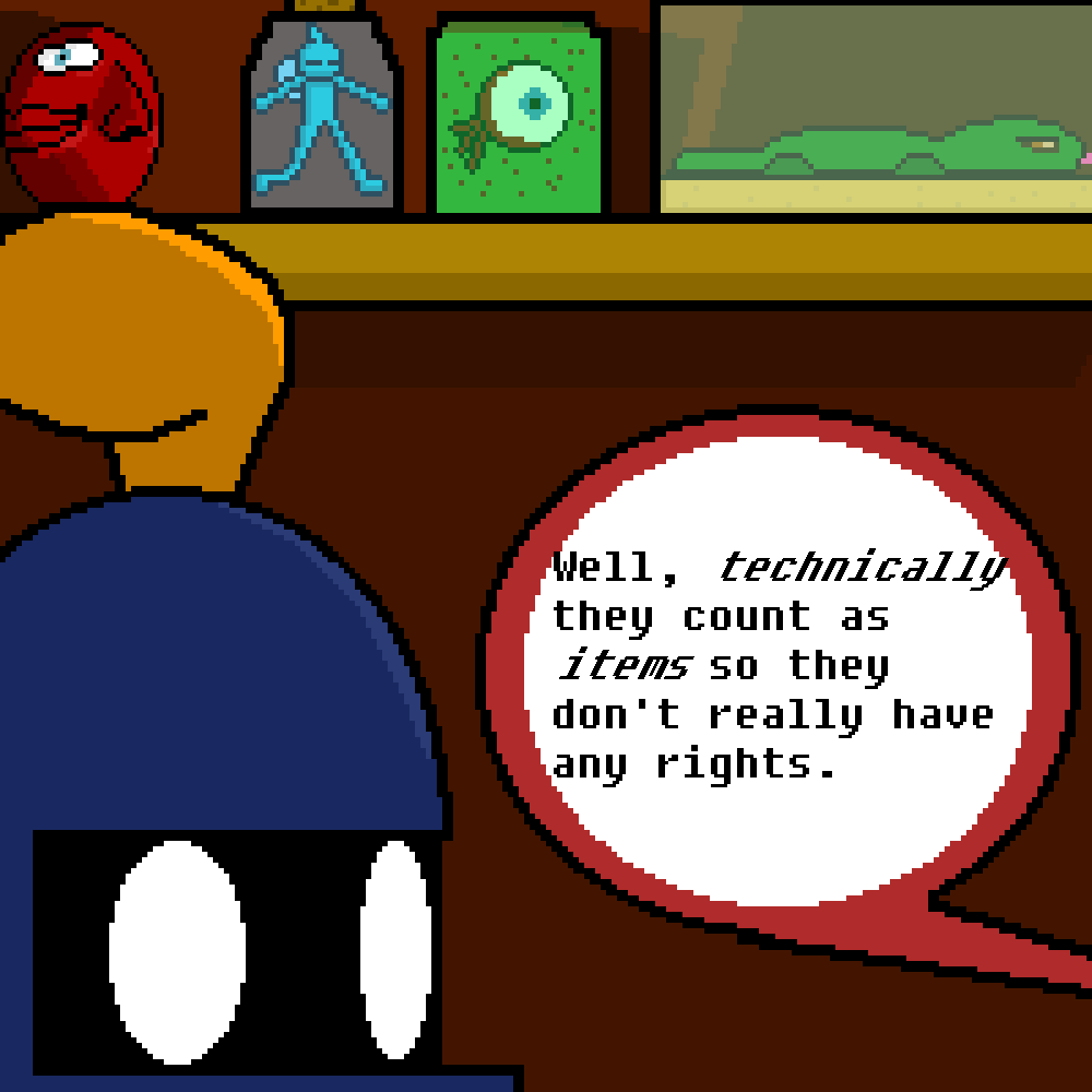
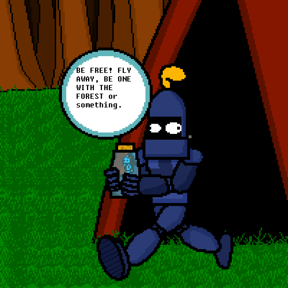
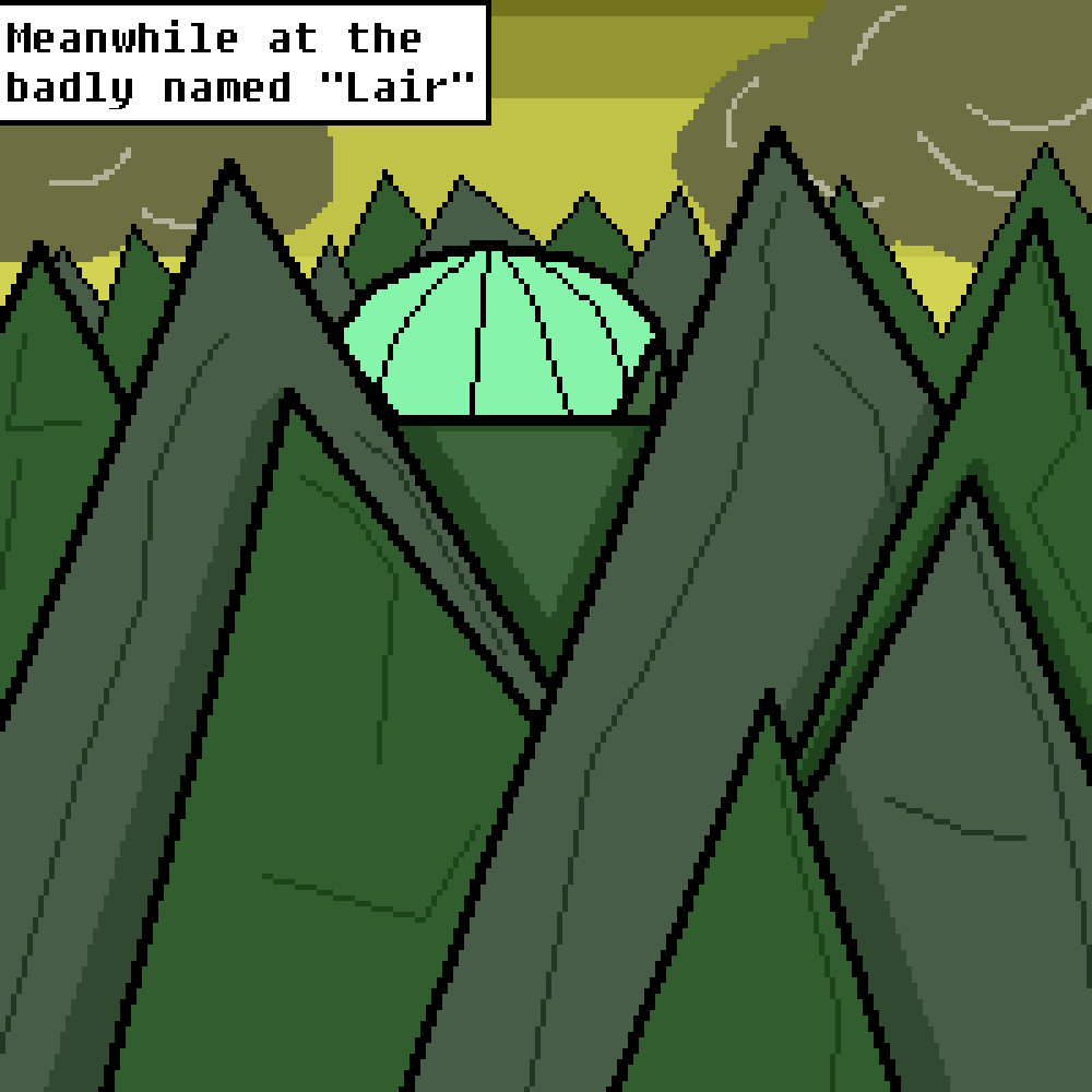
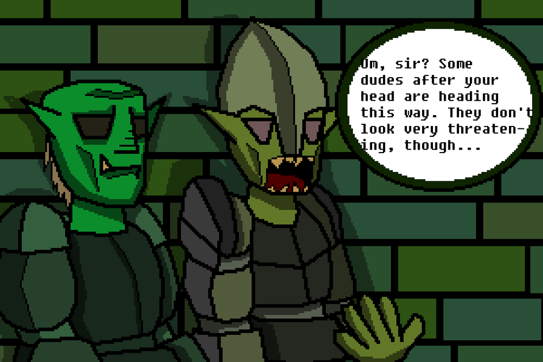
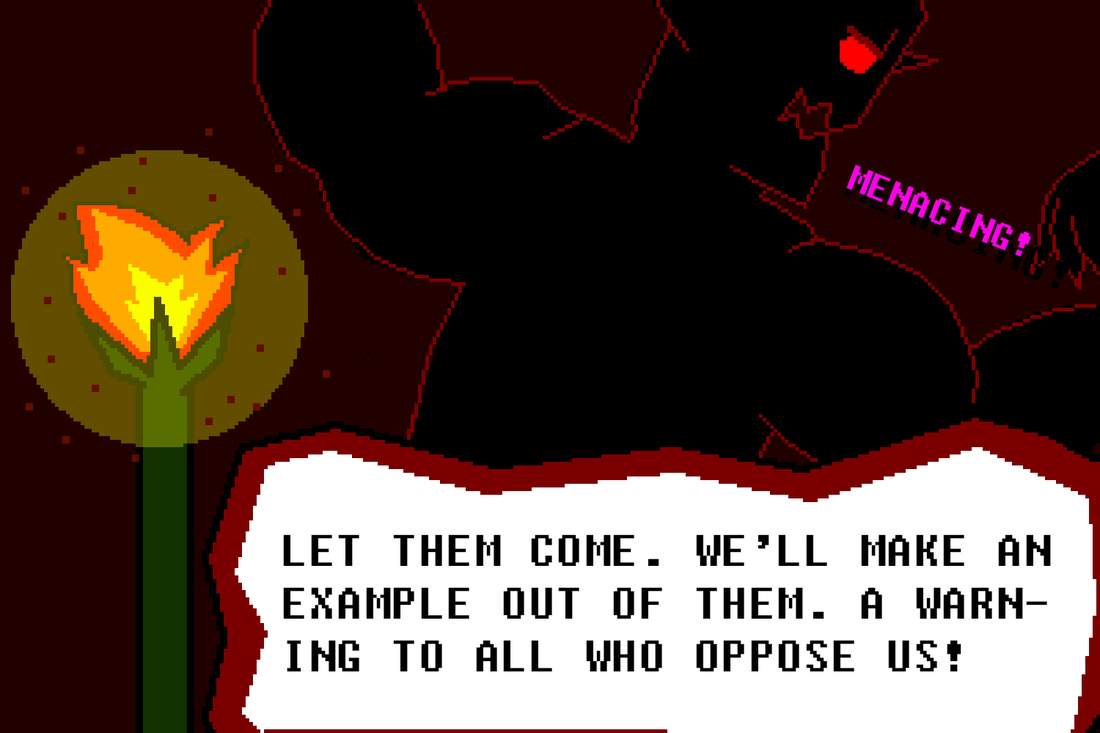
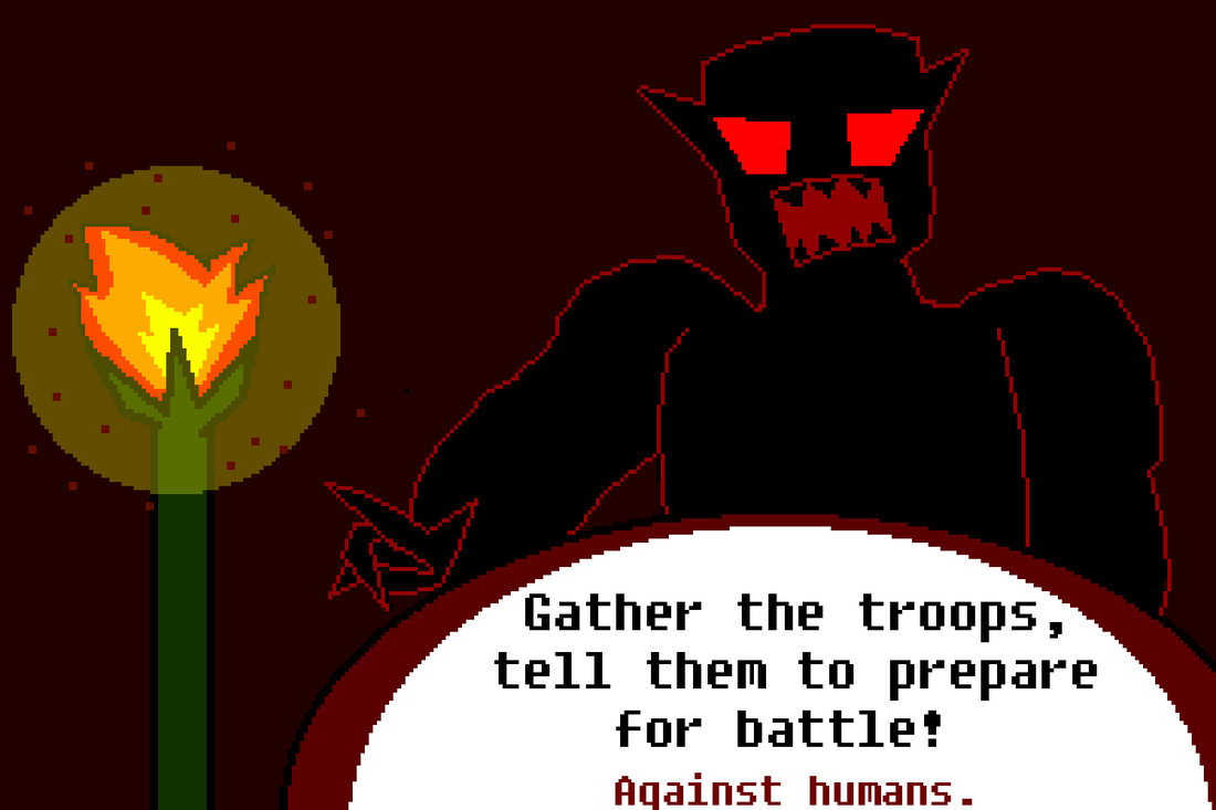
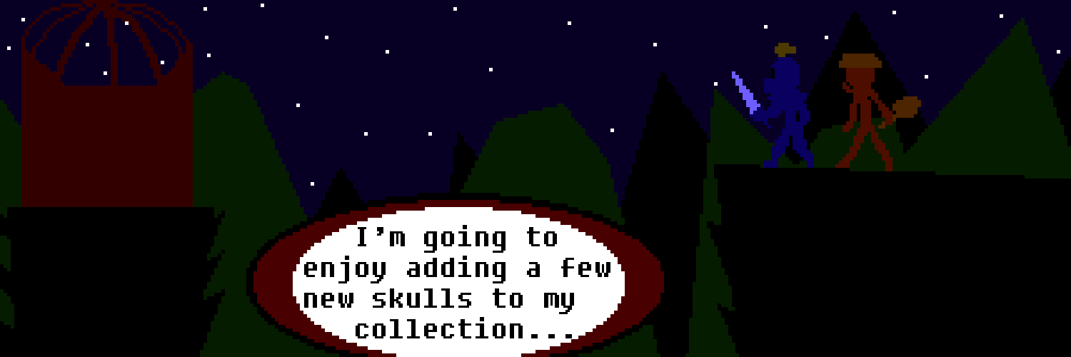
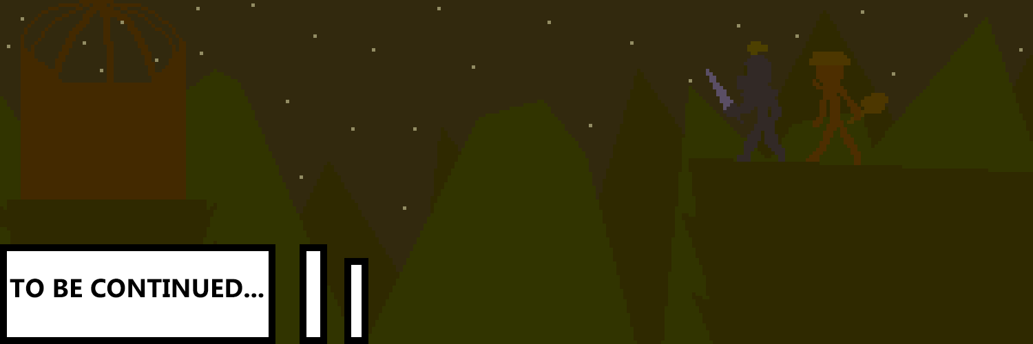
WHOOOOOOOOOO!!!!!! After a little over a year after posting here, I'm back! (although really, this is pretty much talking to myself) This year I have been hard at work creating a comic for AP Studio Art. (My, how the times change.) I wanted to do a comic because why not? I always wanted to make a legit comic instead of dumb doodles with panels in a sketchbook. And it is finally done...ish. I didn't have enough time to fully end the comic so I had to end it on a "TO BE CONTINUED" note. (Boooo.) Oh well. The comic follows the shenanigans of "Martus Blartus," the chivalrous knight. (I guess at that point he's less of a knight than he is a normal warrior...) The character is inspired by a Dungeons & Dragons character I made, "Mart Blart," who had incredible luck. (Martus is a descendant of the original, family tree is still unknown.) The whole comic is just based on, and parodying retro rpgs. So there are some references to video games, of course. (Even a reference to Berserk and a tiny reference to Jojo's Bizarre Adventure) At the beginning of creating this comic, I didn't add a whole lot of shading out of pure laziness, but then I didn't want to be a complete hack, so I eventually shaded the crap out of it. I left the unshaded panels as they were so they would show development and improvement (AP judges like that kind of stuff, right?) And even later I found out how to change the opacity in the art program I used. So I went crazy with it. It helped with shading sometimes, but really I just used it to show transparency and light. It was really fun designing the characters, coloring was a bit annoying, but that's what I always think about coloring. I also made sure to have the characters' outlines be THICK, the superior way to have outlines. I wanted the whole thing to look cartoony, because who doesn't like cartoons?
Man, it feels good to be doing this again. The blogging stuff. Even a bit nostalgic. Ah, Digital Art 1...
0 Comments
 I NEED A BOX OF TISSUES. This semester was a great one with my Digital Art class. It definitely was motivation to get by the school day. Just thinking, "only one more hour before digital art," got me through it. And now it's over. I could really use those tissues now...
Oh right, this is supposed to be a reflection... In Digital Art, we mainly used Photoshop to make, what else but, digital art. Photoshop has so many tools to manipulate, and create images, just going through the filters is cool. I liked it as an art program and would like to use it more often. (Too bad it costs money and I really hate Gimp's interface.) My favorite project was definitely this project, where we animated an image. I really like animation and digital painting... and maybe blogging... Just a little bit I will do so much of this in the field of digital art, I'm hooked. If I had another semester of this class, first of all, I'd be happier than a Russian finding a bottle of vodka, (hehe, referencing older projects) second, I'd want to do more animations and bringing my drawings to the digital world. 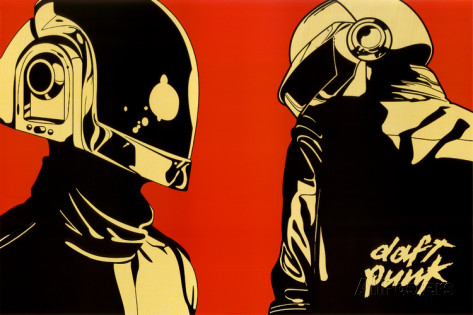 Well, time to make my own logo/poster for my own thingy, instead of designing one for the Music department. So, I must observe other logos/posters, take note of them, see what secrets they hold. Or maybe just feel discouraged because OH MY GOD, THESE ARE SO COOL-LOOKING. But that is not what I'm in this class for. (doesn't mean I don't do it...) Of course music logos and posters are a great source of inspiration. Yes, being inspired by a thing that was made from somebody being inspired by something really is a wonderful thing. So, I chose this Daft Punk poster because, well, I think it looks cool. It's colors are nice, black and tanish-yellow with a contrasting red background, it really puts a focus on Guy Manuel and Thomas Bangalter. The logo itself is small and to the corner, putting greater emphasis on the robots.
Good logos keep the colors simple, but use them to add emphasis on the subject. The logo should be eye-catching, but at the same time should not take away emphasis on the subject, unless it IS the subject. 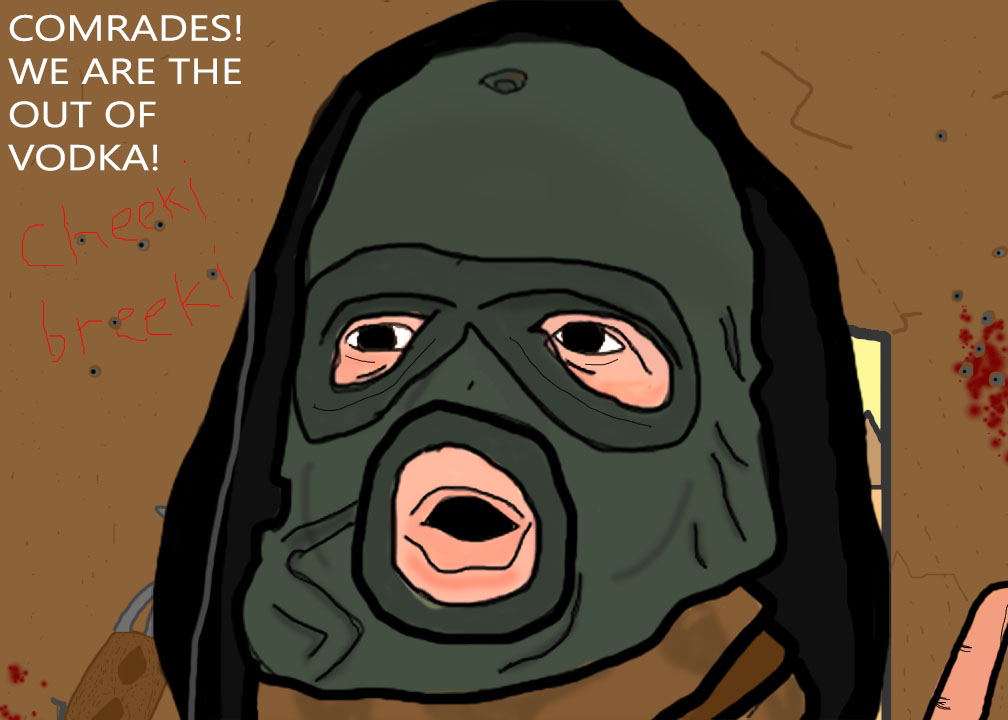 "Get out of here, Stalker." Well I drew a caricature, and it is very Russian. The person is just some guy looking surprised in a balaclava and a hoodie. He reminded me of a character from a video game so that's how I based the coloring and background. The original .psd file would have allowed you to see the background, and Putin in a frame, along with a couple of other details, but oh well. I used multiple layers to color again, and it's pretty cool to do so. I like how the coloring ended up, especially with the balaclava. I kinda didn't like how the lips turned out, but then again, I have zero experience drawing lips, mouths I can do, but lips... He could have been drawn more surprised. I shall end this with the most Russian name ever. 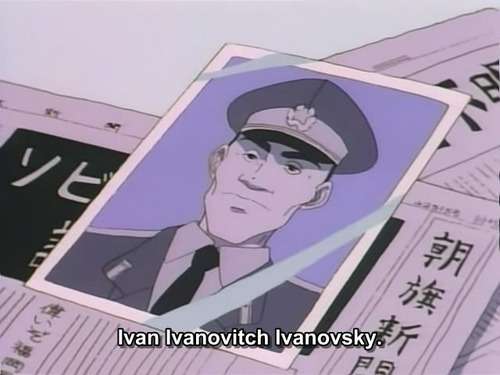 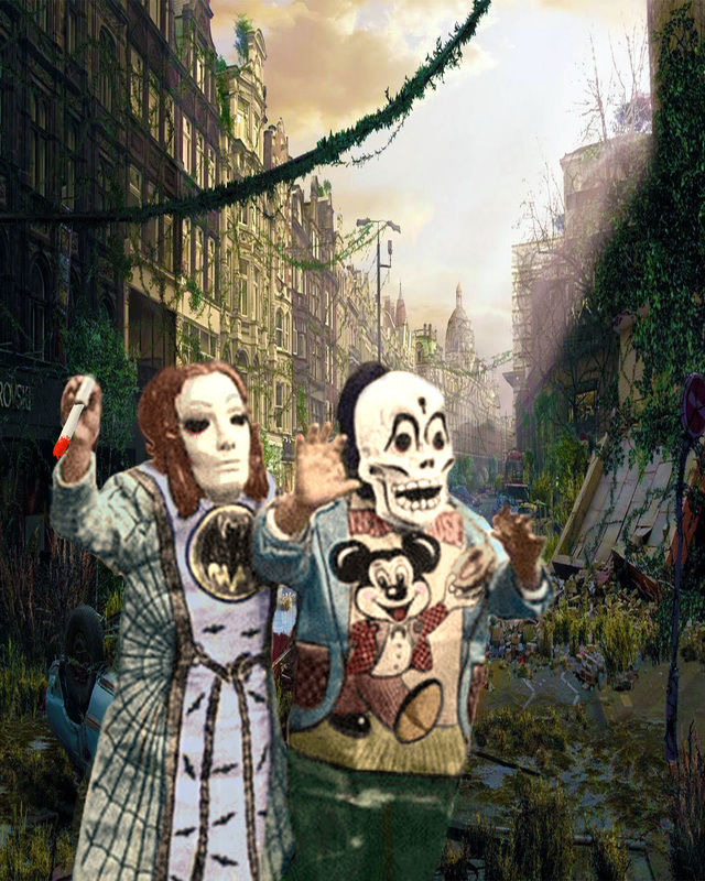 Spooky... Well this was a pretty interesting project that I had fun with, taking an old black and white photo and putting it in a new environment while adding color to it. It was kinda a hassle to give color to the black and white photo, but the end result is very satisfying, just going back and forth between the old and new photos is fun. How I colored was that I had two extra layers for coloring, I put the opacity to 12% and colored in. I made different colors by using the fact that I'm using two layers to color to my advantage. The skin color was kinda hard to do, I tried a lot of different color combinations, and it was worth it. Also, I made the girl hold a knife for extra spooks. The background is a post-apocalyptic setting. Even after the apocalypse, there's still Halloween... except the costumes are real... and it's probably really dangerous (White vans would be the LEAST of their problems).
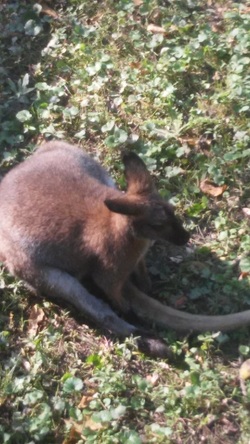 Quite a difference between these tw-OH MY GOD, WHY IS THE TEXT TO THE SIDE INSTEAD OF UNDERNEATH!? So I took a picture of a kangaroo (I think) at the zoo and I photoshopped the hop out of it... So the filter that this uses is Cutout, and it looks really cool. I manipulated the colors a little bit, and I used the dodge and burn tool. It sorta follows the rule of thirds because it's a bit off center. I like how colorful the kangaroo is compared to the grass it's sitting in, it's a nice contrast. 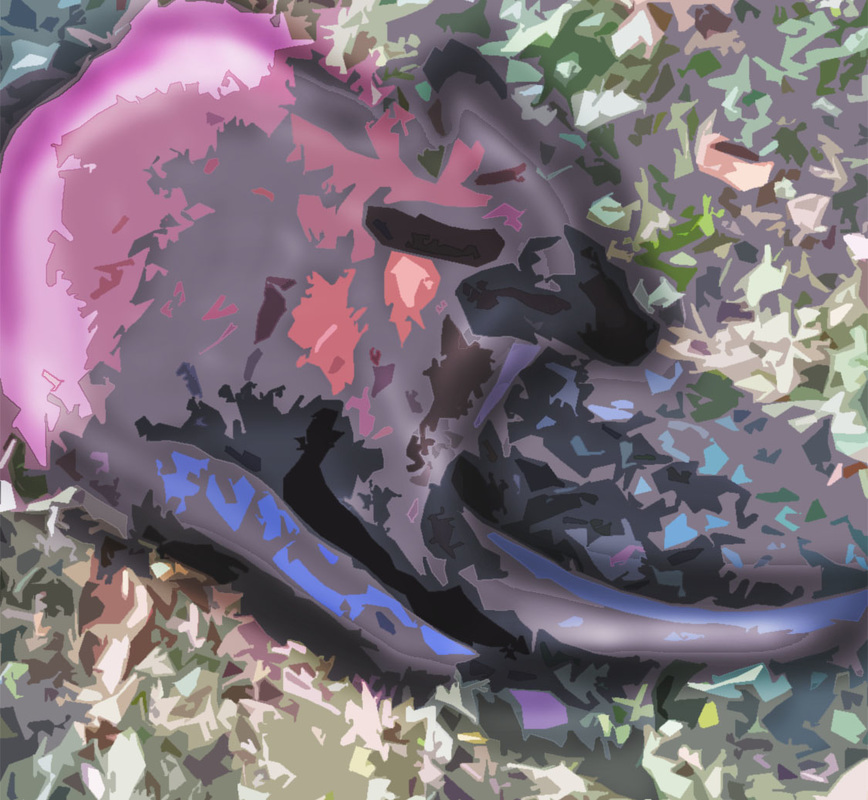 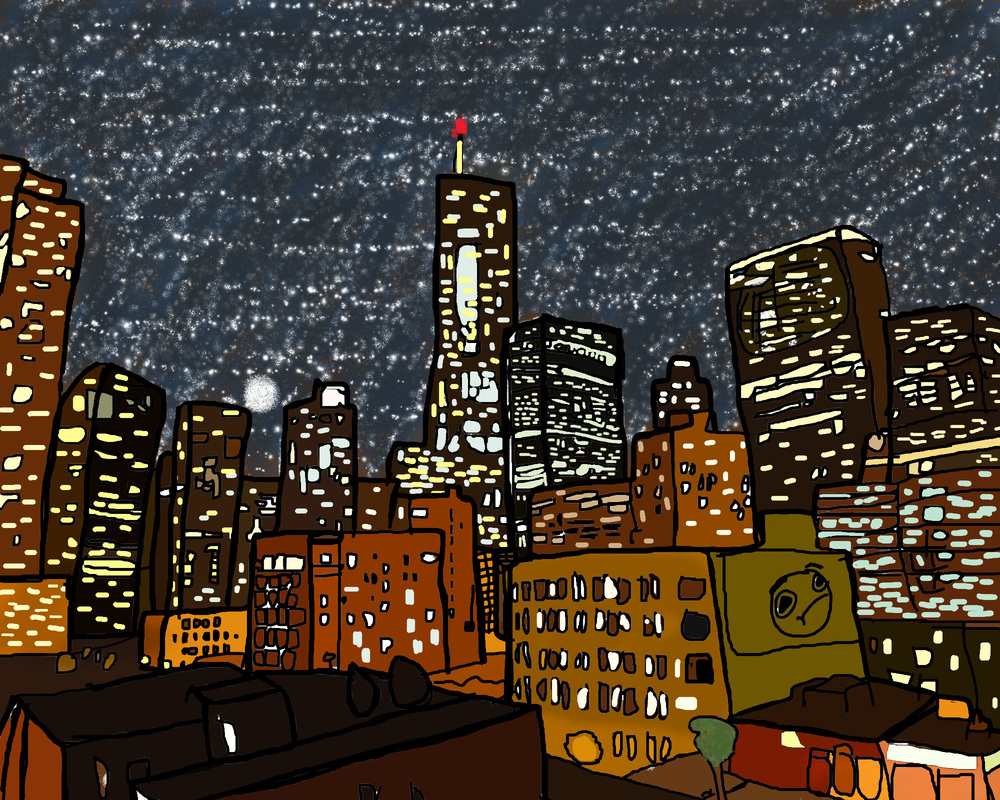 So this is a painting of a really nice angle of Chicago. I got the original photo (http://tinyurl.com/pwdno6e) from tripadvisor. I traced the outlines in photoshop, and I pretty much winged the majority of this painting. The sky is completely different than the original photo. It was too cloudy and boring, so I made the sky unrealistically have a bunch of stars in a city... who cares if it's unrealistic, it's cool. How I colored the buildings was really tedious, I used the water dropper to get the color of the building from the original photo. The buildings' colors were... interesting, but once they were all together, I liked how they turned out. The biggest thing I winged it on was the windows. I just drew window shapes on the buildings at random, but trying to keep somewhat of a pattern. I had to outline the painting a lot to make the buildings stand apart from each other... also because I just like outlines...
Overall, I really liked how this came out, and using Wacom tablets was cool, but I had... problems with them. 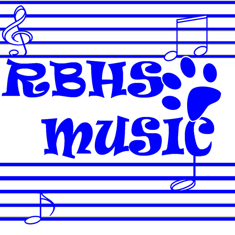 (ARG. IT DELETED WHAT I WROTE.) Well, this is my entry for the logo of the school's music department. RBHS Music in a fun font between two scales with notes randomly put in and of course, it's all in the school's colors.
I did a lot of research on logos by staring at an album cover for an hour, so I'm pretty much an expert now! I think it demonstrates the music department in a totally non-cheesy way. Why would music notes and a scale be cheesy!? It demonstrates the principles of design, there is balance in the piece from the two scales on opposite sides and the music notes. It has emphasis on the title because it's big, it's eye-catching, and it's right in the middle. It has multiple layers, it's shapes are simple, the color shows school pride, the text is fun, and #nofilter. (Ugh, I can't believe I just hash tagged...) I'm pretty happy with how this turned out. 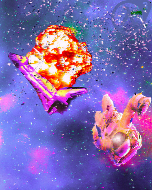 I REDID IT AND IT LOOKS BETTER AND STUFF.
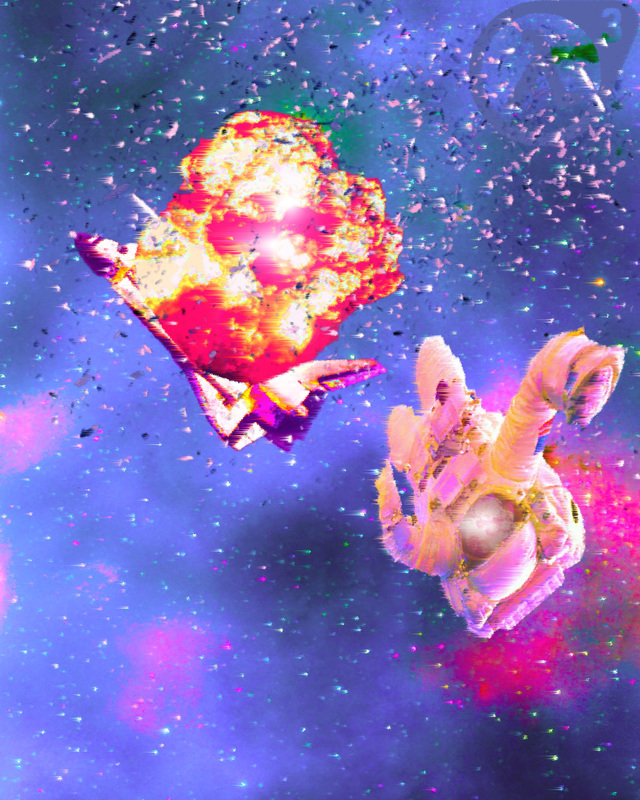 Well, this is my Slice and explode project. I chose explode as you can see. I'm pretty happy with the way it turned out, except for the explosion. It needs some tweaking. I really wanted to put emphasis on the explosion, so I made it clash with the colors of the shuttle, the astronaut, and the background. I really wanted it to stick out, and it does. I manipulated the colors a lot and I think the astronaut came out well, but the shuttle looks a little...weird...
My Goals to make it look better: 1. Better shading 2. Make the shuttle look less weird 3. Improve the look of the explosion 4. Make it more proportional 5. Move some of the things around to make it look more balanced. 6. Profit. |
AuthorI do stuff. A nuuu cheeki breeki. Archives
April 2017
Categories |


 RSS Feed
