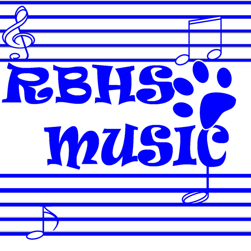
 (ARG. IT DELETED WHAT I WROTE.) Well, this is my entry for the logo of the school's music department. RBHS Music in a fun font between two scales with notes randomly put in and of course, it's all in the school's colors.
I did a lot of research on logos by staring at an album cover for an hour, so I'm pretty much an expert now! I think it demonstrates the music department in a totally non-cheesy way. Why would music notes and a scale be cheesy!? It demonstrates the principles of design, there is balance in the piece from the two scales on opposite sides and the music notes. It has emphasis on the title because it's big, it's eye-catching, and it's right in the middle. It has multiple layers, it's shapes are simple, the color shows school pride, the text is fun, and #nofilter. (Ugh, I can't believe I just hash tagged...) I'm pretty happy with how this turned out.
0 Comments
Leave a Reply. |
AuthorI do stuff. A nuuu cheeki breeki. Archives
April 2017
Categories |
 RSS Feed
