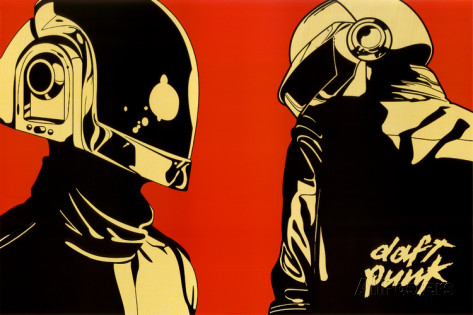
 Well, time to make my own logo/poster for my own thingy, instead of designing one for the Music department. So, I must observe other logos/posters, take note of them, see what secrets they hold. Or maybe just feel discouraged because OH MY GOD, THESE ARE SO COOL-LOOKING. But that is not what I'm in this class for. (doesn't mean I don't do it...) Of course music logos and posters are a great source of inspiration. Yes, being inspired by a thing that was made from somebody being inspired by something really is a wonderful thing. So, I chose this Daft Punk poster because, well, I think it looks cool. It's colors are nice, black and tanish-yellow with a contrasting red background, it really puts a focus on Guy Manuel and Thomas Bangalter. The logo itself is small and to the corner, putting greater emphasis on the robots.
Good logos keep the colors simple, but use them to add emphasis on the subject. The logo should be eye-catching, but at the same time should not take away emphasis on the subject, unless it IS the subject.
0 Comments
Leave a Reply. |
AuthorI do stuff. A nuuu cheeki breeki. Archives
April 2017
Categories |
 RSS Feed
